Insights / Articles
Data Visualization: The Convergence of Scientific Data and Value-based Graphics
Written by Justin Sodano, PA, Head of Global Studio (US) on Thursday, April 11, 2024
Introduction
Let’s face it, data is at the heart of everything we do in the pharmaceutical, biotech, and medical device industries. Our research and development activities, clinical studies, submissions to regulatory authorities, product claims, and scientific and medical communications are all fundamentally focused on data. So why is it that we don’t spend more time illuminating our data in more visually engaging and accurate ways to communicate such critical information?
Despite the breakneck speed at which artificial intelligence is evolving, the ease of collecting and availability of large amounts of data means that there is still an unmet need for medical communication professionals to be able to interpret and communicate information to key stakeholders in a visually impactful manner. And more importantly, to present this information in an easily digestible, “to the point” format to get the message across quickly.
Within Medical Affairs, one way we can accomplish this is by utilizing effective data visualization techniques. During this year’s 2024 Medical Affairs Professional Society (MAPS) Meeting in Puerto Rico, OPEN Health sponsored and presented a series of interactive sessions on this very topic, entitled Illuminating the Data: Unlocking the Possibilities of Data Visualization, from Theory to Practice.
As defined in the presentation, data visualization is the representation of data through the use of common graphics such as charts, plots, infographics, and even animations.1 Sounds simple enough, right? Well, not so fast, there’s more to it. And by more, we don’t just mean technique and skill, but the involvement of more people from the start. Data visualization is not a “one-stop shop” in terms of departments or silos within an organization.
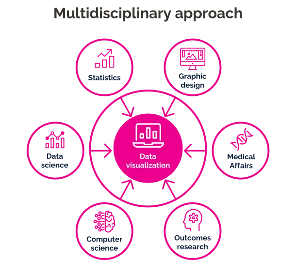
It requires a multidisciplinary and multi-departmental approach, not only for collecting and interpreting the data, but also for creating effective data visualization outputs. Leveraging the skills, techniques, and software programs from data scientists, outcomes researchers, and graphic designers, in combination with insights from Medical Affairs representatives (e.g. medical directors, medical scientific liaisons [MSLs], etc.), can help optimize the meaning and effectiveness of an information graphic.
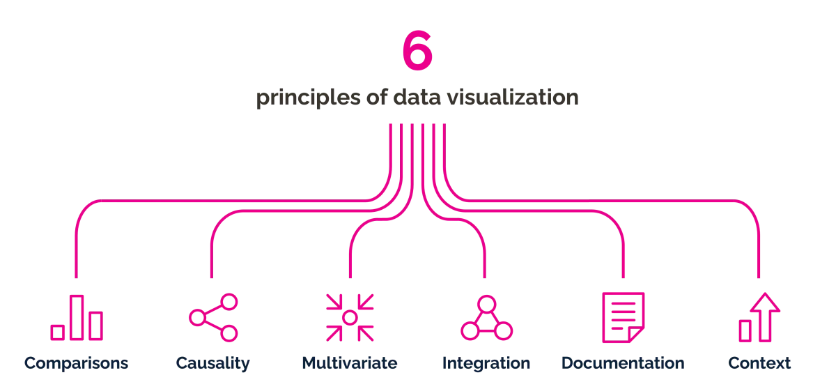
The principles
As highlighted in our recent sessions, Edward Tufte, the “da Vinci of data” or “Galileo of graphics”2 outlines six principles on how to portray data accurately. These include:3
- Comparisons: Illustrate the similarities or differences between two or more dependent variables
- Causality: Depict how a change in one or more independent variables influences a dependent variable
- Multivariate: Compile and transform varying sets of complex data into an easily interpretable narrative
- Integration: Combine information from multiple sources into one coherent dataset
- Documentation: Include appropriate attributions, titles, and measurements
- Context: Provide information that is essential for understanding the data and incorporate trendlines, when appropriate, to predict future results
How to “Data Viz”
Once you have assembled your data visualization “go-to” team, identified the statistical and graphic design programs that are at your disposal within your organization, and understand the principles of data visualization, you can start to conceptualize your information graphic.
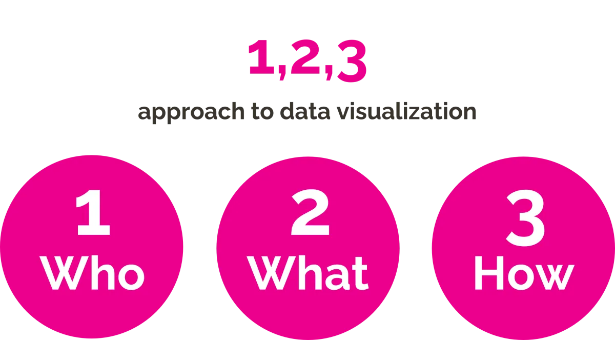
To do this, ask yourself the following questions outlined in our simple 1,2,3 approach, based on IBM’s data visualization best practices4:
- Who is your audience?
- What is the best visual(s) to use?
- How can it be simplified or refined?
Who (audience)
Before even putting pen to paper or pushing pixels, knowing your audience is key. The type of visual or chart type you choose hinges on the audience with whom you plan to communicate. What type of information is most important to that audience? Does it need to be a basic graph with aggregate data for a generalist or patient (i.e. written in plain language)? Or does it need to be a more elaborate visual with patient-specific data demonstrating the finer points of individual responses for a specialist? Knowing the level of knowledge of your target audience, the types of information they are interested in, and what might be most impactful to them will help guide your decision on what data to include or exclude.
What (chart type)
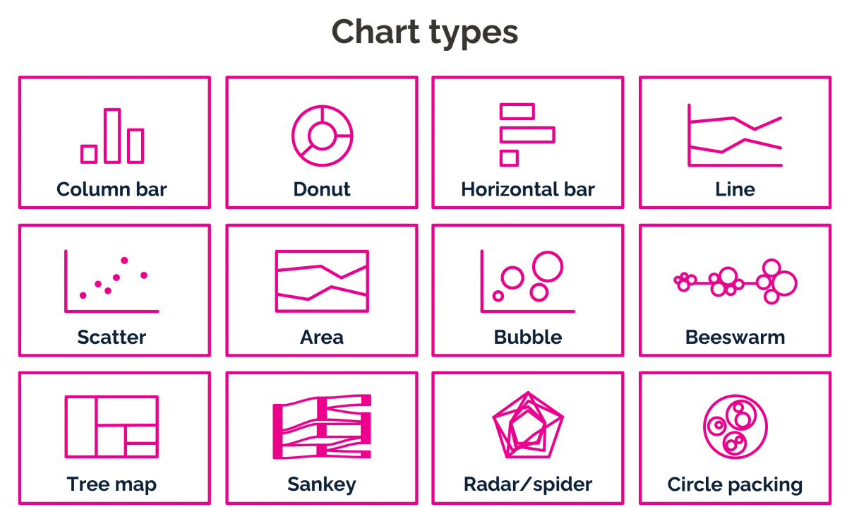
The type of chart(s) you choose is fundamental in data visualization. Understanding what chart types are available within the programs you are using and what they best represent are essential when creating your visual. Do your data set and key point lend themselves to a comparison of categories, which is best illustrated with a column graph, horizontal bar graph, or line chart? Is there a need to demonstrate a relative relationship between two or three variables, which can be achieved with a scatter plot or bubble graph? Are your data more like a static composition or “parts-to-a-whole” story, which may be best presented as a donut graph, tree map, starburst graph, stacked bar graph, or circle packing graph? Does your composition graph include an element of time, such that a stacked bar graph, stacked area graph, or Sankey diagram would be appropriate? Or do your data focus more on the distribution of data over time, which could be represented by a scatter plot, line histogram, or beeswarm plot?
How (simplify/refine)
The beauty of data visualization is pure, accurate simplicity. The ability to take complex multivariate data and present them in a simplified, easily accessible manner is what makes great data visualization so powerful. In the end, that is what data visualization is intended to do: communicate key information quickly and accurately, while leaving a memorable impression on the viewer.
How does one simplify graphs? By removing the unnecessary chart clutter. There are many terms for non-essential graphical elements or data. Fundamentally, you must focus on what information adds value to your data visualization story and what is distracting or misleading. Is it necessary to have an axis if all the bars have data labels? Is there a need for horizontal grid lines that may make some viewers go cross-eyed? Think about the amount of time your brain needs to process each element and color on a graph. Less is more – the fewer unnecessary elements or less information your graphic has, the more impact it will have on the audience.
Embrace the process
Finding the right chart(s) or graphic(s) that works best for the data takes time. This is where refinement comes in. Plotting the data using different chart types and experimenting with varying combinations of graphs will help you discover the right blend of charts and graphical elements. Ultimately, the data should speak for themselves. If the main message of the visual is not intuitive to the target audience, then you need to keep refining your graphic.
The Future is Bright for Data Viz
As mentioned earlier in this article, data visualization is not limited to one department or discipline. The future of data visualization goes beyond the static page. There are numerous platforms and programs available that can assimilate large data sets and allow for interactivity with these data for use in omnichannel medical communication plans. Utilizing cutting-edge technologies, artificial intelligence, and proven methodologies, the sky is the limit as to how elaborate or engaging we can make our information graphics. Consulting first with your organizations’ information technology teams and gaining awareness of your information security policies are important first steps. In doing so, you may discover graphical and statistical programs that are already being used within your organization, while gaining a clear understanding or where and how you can work with your data on future visuals.
Data is the heart of medical communications; it’s time to bring it to life by creating impactful data visualizations.
Working in partnership with our clients, we embrace our different perspectives and strengths to deliver fresh thinking and solutions that make a difference.
Together we can unlock possibilities.
For information about OPEN Health’s services and how we could support you, please get in touch.
1. Medical Affairs Professional Society. Transforming evidence generation with data visualization: New approaches for Medical Affairs. https://www.medicalaffairs.org… (accessed February 2024)
2. Edward Tufte. Analyzing/presenting data/information: An online video course taught by Edward Tufte. https://www.edwardtufte.com/tu… (accessed April 2024).
3.International Service Design Institute. Tufte’s 6 principles for graphical integrity (adopted for service design. https://www.internationalservi… (accessed February 2024).
4. IBM. What is data visualization? https://www.ibm.com/topics/data-visualization (accessed February 2024).